|
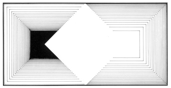
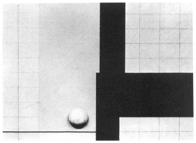
(2) Contrast Some "change" must be created in a screen to create a dynamic balance in contrast with a balance of a simple static harmony. Though there are various methods and kinds in the "change", one of the most violent things is the contrast. It is the purpose of the contrast to create a feeling of tension by comparing things which have opposite natures. The "things which has opposite natures" are sometimes shapes, and sometimes colors and textures. We can't generally conclude the following since they are sometimes a size or an arrangement. But, It is a major purpose of the contrast to create a comparison effect by combining things with different natures or by creating extremely different situations. Figure 273 is an example of a work example which utilizes a comparison of right and left. The same shapes stand opposite to each other with the brightness comparison of black and white, and thin parallel lines stand opposite to each other by reversing the roughness and fineness. In Figure 274, the contrast of shapes and colors is the major contents of this work. As for shapes, the black block in the right has strong contrast with the thin lines and the circle. In addition, the consideration related to the arrangement
in others is made, too. In Figure 275, a strong
feeling of tension is created using things of different qualities such
as shapes and materials respectively. The nature of the both things are
made distinguished all the more. The effect of such comparison produces
a pleasant feeling.
|