(5) Illusion on brightness

There is an influence to the "sight" coming from the comparison of brightness as has already been clarified in the theory of colors (Fig. 346)

Figure 347 is a popular figure which frequently appears in books on psychology. This effect is thought to be both due to spreading light phenomenon and to brightness comparison.

Brightness inside each rectangle is felt differently as shown in Figure 348. This is because the brightness comparison occurs in each boundary of the rectangle of different colors.

There is also comparison on the hue and chroma in the study of colors.


(6) Visual angle designation

This is a diagram which becomes clear when it is seen from a specific view point though it is difficult to understand what is drawn there by just one glance. Most tricky pictures which belong to this category specify an angle to be seen.

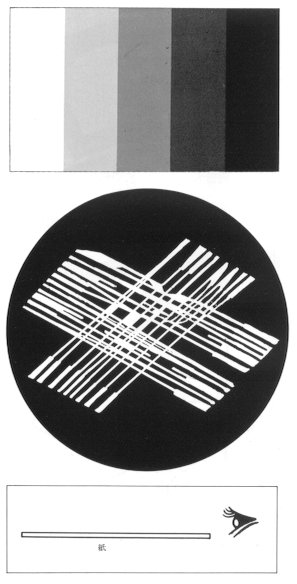
Figure 349-a is a pattern used in a New Year's greeting card. Words of congratulations for a New Year will appear when it is seen from a glancing angle close to the surface of the paper with your eyes like a flat fish. A sheath painting with a cylinder shape should be seen from the upper oblique position, and an anamorphoses of a pyramid mirror should be seen from the upper position of the top corner. 
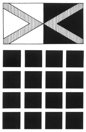


346
347
 
348
349-a
349-b


Figure 346: A letter on a black background looks brighter than a letter on a white background.
Figure 347: Gray color appears at the intersection of the white roads.
Figure 348: A part next to a bright part looks dark. On the contrary, another part next to a dark
                       part looks bright.
Figure 349-a: From "Handbook of Early Advertising Art".
Figure 349-b: How to look at Fig.  349a.


NEXT

CONTENTS