|
A Mathematical Theory of Interface Aesthetics David Chek Ling Ngo and Lian Seng Teo Faculty of Information Technology Multimedia University 63100 Cyberjaya, Malaysia John G. Byrne Department of Computer Science Trinity College Dublin 2, Ireland Abstract An important aspect of screen design is aesthetic evaluation of screen layouts. While it is conceivable to define a set of variables that characterize the key attributes of many alphanumeric display formats, such a task seems difficult for graphic displays because of their much greater complexity. This article proposes a theoretical approach to capture the essence of artists' insights with fourteen aesthetic measures for graphic displays. The formalized measures include balance, equilibrium, symmetry, sequence, cohesion, unity, proportion, simplicity, density, regularity, economy, homogeneity, rhythm, and order and complexity. The paper concludes with some thoughts on the direction which future research should take. Keywords: Screen design, interface aesthetics, aesthetic measures, aesthetic characteristics, multi-screen interfaces 1. Introduction The role of aesthetics in human affairs has been widely documented [1]. Certainly, it is related to our appreciation of computer systems as well. However, some [2; 3] warn against a tendency among designers to emphasize the aesthetic elements of the user interface, because these might degrade usability. In fact, interface aesthetics play a greater role in affecting system usability and acceptability than we might be willing to admit. Careful application of aesthetic concepts can aid:
There are four basic ways to use windows [16].
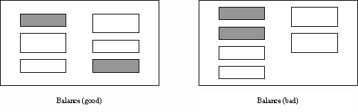
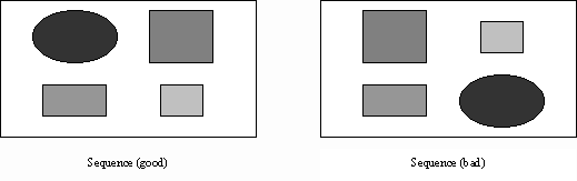
2. Aesthetic Measures Many noteworthy texts discuss theories of design in both fine and commercial art. Arnheim [17] and Dondis [18] are good examples. From the literature on screen design, Galitzs book on design and layout, The Essential Guide to User Interface Design [19], presents an extensive list of very specific guidelines for the design of screens. This article relies heavily on this and other similar works [20] to help demonstrate our approach. Observe that the range of the following measures is between 0 (worst) and 1 (best). 2.1. Measure of Balance Balance, illustrated in Figure 1, can be defined as
the distribution of optical weight in a picture. Optical weight refers
to the perception that some objects appear heavier than others. Dark colours,
unusual shapes, and larger objects are heavier, whereas light colours,
regular shapes, and small objects are lighter. Balance in screen design
is achieved by providing an equal weight of screen elements, left and right,
top and bottom.
Figure 1. A comparison of good and bad screens in balance study Balance is computed as the difference between total weighting of components
on each side of the horizontal and vertical axis and is given by
BMvertical and BMhorizontal are, respectively, the vertical and horizontal balances with
with
amax is the area of the largest object on the frame with
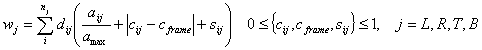
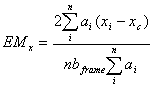
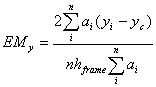
where L, R, T, and B stand for left, right, top, and bottom, respectively; aij, cij, and sij are, respectively, the area, colour, and shape of object i on side j; dij is the distance between the central lines of the object and the frame; and nj is the total number of objects on the side. Each colour is given a weighting between 0 (white) and 1 (black). In Addendum A, we describe a measure for describing shapes given by Birkhoff [21]. 2.2. Measure of Equilibrium Equilibrium is a stabilisation, a midway centre of suspension. Equilibrium on a screen is accomplished through centring the layout itself. The centre of the layout coincides with that of the frame. (There are minor deviations from this definition, which we discuss in Section 3.) Equilibrium is computed as the difference between the centre of mass
of the displayed elements and the physical centre of the screen and is
given by
The equilibrium components along the x-axis (EMx) and y-axis (EMy) are given by
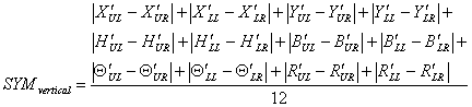
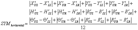
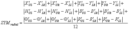
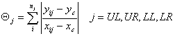
where (xi,yi) and (xc,yc) are the co-ordinates of the centres of object i and the frame; ai is the area of the object; bframe and hframe are the width and height of the frame; and n is the number of objects on the frame. (Note that the maximum values of |xi-xc| and |yi-yc| are bframe/2 and hframe/2.) 2.3. Measure of Symmetry Symmetry is axial duplication: A unit on one side of the centre line is exactly replicated on the other side. Vertical symmetry refers to the balanced arrangement of equivalent elements about a vertical axis, and horizontal symmetry about a horizontal axis. Radial symmetry consists of equivalent elements balanced about two or more axes that intersect at a central point. Symmetry, by definition, is the extent to which the screen is symmetrical
in three directions: vertical, horizontal, and diagonal and is given by
SYMvertical, SYMhorizontal, and SYMradial are, respectively, the vertical, horizontal, and radial symmetries with
where X¢j, Y¢j, H¢j, B¢j, Q¢j, and R¢j are, respectively, the normalised values of Xj, Yj, Hj, Bj, Qj, and Rj with
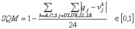
where UL, UR, LL, and LR stand for upper-left, upper-right, lower-left, and lower-right, respectively; (xij,yij) and (xc,yc) are the co-ordinates of the centres of object i on quadrant j and the frame; bij and hij are the width and height of the object; and nj is the total number of objects on the quadrant. 2.4. Measure of Sequence Sequence, illustrated in Figure 2, in design refers
to the arrangement of objects in a layout in a way that facilitates the
movement of the eye through the information displayed. Normally the eye,
trained by reading, starts from the upper left and moves back and forth
across the display to the lower right. Perceptual psychologists have found
that certain things attract the eye. It moves from big objects to small
objects, from bright colours to subdued colours, from colour to black and
white, and from irregular shapes to regular shapes.
Figure 2. A comparison of good and bad screens in sequence study Sequence, by definition, is a measure of how information in a display
is ordered in relation to a reading pattern that is common in Western cultures
and is given by
with
with
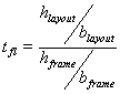
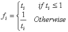
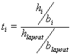
where UL, UR, LL, and LR stand for upper-left, upper-right, lower-left, and lower-right, respectively; A, C, and S stand for size, colour, and shape, respectively; and aij, cij, and sij are, respectively, the area, colour, and shape of object i on quadrant j. The colour range is between 0 (white) and 1 (black). sij is calculated as explained in Addendum A. Each quadrant is given a weighting in q. 2.5. Measure of Cohesion In screen design, similar aspect ratios promote cohesion. The term aspect ratio refers to the relationship of width to height. Typical paper sizes are higher than they are wide, while the opposite is true for typical VDU displays. Changing the aspect ratio of a visual field may affect eye movement patterns sufficiently to account for some of the performance differences. The aspect ratio of a visual field should stay the same during the scanning of a display. Cohesion, by definition, is a measure of how cohesive the screen is
and is given by
CMfl is a relative measure of the ratios of the layout and screen with
and CMlo is a relative measure of the ratios of the objects and layout with
with
with
where bi and hi, blayout and hlayout, and bframe and hframe are the widths and heights of object i, the layout, and the frame, respectively; and n is the number of objects on the frame. 2.6. Measure of Unity Unity is coherence, a totality of elements that is visually all one piece. With unity, the elements seem to belong together, to dovetail so completely that they are seen as one thing. Unity is achieved by using similar sizes, shapes, or colours for related information and leaving less space between elements of a screen than the space left at the margins. Unity, by definition, is the extent to which the screen elements seem
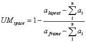
to belong together and is given by
UMform is the extent to which the objects are related in size, shape, and colour with
and UMspace is a relative measure of the space between groups and that of the margins with
where ai, alayout, and aframe are the areas of object i, the layout, and the frame, respectively; nsize, ncolour, and nshape are the numbers of sizes, colours, and shapes used, respectively; and n is the number of objects on the frame. 2.7. Measure of Proportion Down through the ages, people and cultures have had preferred proportional relationships. What constitutes beauty in one culture is not necessarily considered the same by another culture, but some proportional shapes have stood the test of time and are found in abundance today. Marcus [3] describes the following shapes as aesthetically pleasing.
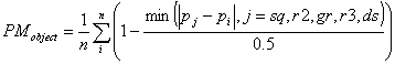
Proportion, by definition, is the comparative relationship between the
dimensions of the screen components and proportional shapes and is given
by
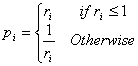
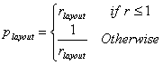
PMobject is the difference between the proportions of the objects and the closest proportional shapes described by Marcus with
and PMlayout is the difference between the proportions of the layout and the closest proportional shape with
with
with
where bi and hi are the width and height of object i; blayout and hlayout are the width and height of the layout; and pj is the proportion of shape j. (Note that the maximum value of (pj-rlayout) is 0.5.) 2.8. Measure of Simplicity Simplicity is directness and singleness of form, a combination of elements that results in ease in comprehending the meaning of a pattern. Simplicity in screen design is achieved by optimising the number of elements on a screen and minimising the alignment points. Tullis [9] has derived a measure of screen complexity for text-based screens based on the work of Bonsiepe [22], who proposed a method of measuring the complexity of typographically designed pages through the application of information theory. It involves counting the number of different rows or columns on the screen that are used as starting positions of alphanumeric data items. Information theory is then used to calculate the complexity of this arrangement of starting positions. An easier method of calculation is
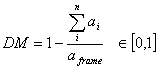
where nvap and nhap are the numbers of vertical and horizontal alignment points; and n is the number of objects on the frame. 2.9. Measure of Density Density is the extent to which the screen is covered with objects. Density is achieved by minimising screen density levels. A measure of density, derived by Tullis, is the percentage of character positions on the entire frame containing data. Instead of looking at characters, our measure deals with objects with
where ai and aframe are the areas of object i and the frame; and n is the number of objects on the frame. 2.10. Measure of Regularity Regularity is a uniformity of elements based on some principle or plan. Regularity in screen design is achieved by establishing standard and consistently spaced horizontal and vertical alignment points for screen elements, and minimising the alignment points. Regularity, by definition, is a measure of how regular the screen is
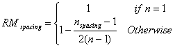
and is given by
RMalignment is the extent to which the alignment points are minimised with
and RMspacing is the extent to which the alignment points are consistently spaced with
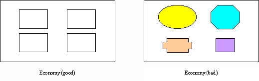
where nvap and nhap are the numbers of vertical and horizontal alignment points; nspacing is the number of distinct distances between column and row starting points; and n is the number of objects on the frame. 2.11. Measure of Economy Economy, illustrated in Figure 3, is the careful and
discreet use of display elements to get the message across as simple as
possible. Economy is achieved by using as few styles, displays techniques,
and colours as possible.
Figure 3. A comparison of good and bad screens in economy study Economy, by definition, is a measure of how economical the screen is
and is given by
where nsize, ncolour, and nshape are the numbers of sizes, colours, and shapes used, respectively. 2.12. Measure of Homogeneity Entropy was developed in physics in the 19th century and was applied later in astronomy, chemistry and biology. Entropy influenced almost every science. We interpret the statistical entropy concept for screen design. The entropy equation is given by the following
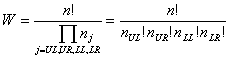
where S is the entropy of the screen, k is a constant, known as Boltzmann's constant, and W is a measure of the degree of homogeneity. Since increases or decreases of W are equivalent respectively to increases or decreases of S, we can conveniently work with W below rather than with S. The relative degree of homogeneity of a composition is determined by how evenly the objects are distributed among the four quadrants of the screen. The degree of evenness is a matter of the quadrants that contain more or less nearly equal numbers of objects. Homogeneity, by definition, is a measure of how evenly the objects are
distributed among the quadrants and is given by
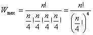
W is the number of different ways a group of n objects can be arranged for the four quadrants when nj is the total number of objects in quadrant j, that is
W is maximum when the n objects are evenly allocated to the various quadrants of the screen, as compared to more or less uneven allocations among the quadrants, and thus
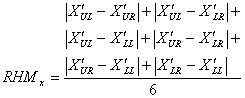
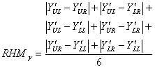
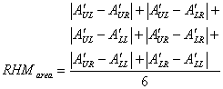
where nUL, nUR, nLL, and nLR are the numbers of objects on the upper-left, upper-right, lower-left, and lower-right quadrants, respectively; and n is the number of objects on the frame. 2.13. Measure of Rhythm Rhythm in design refers to regular patterns of changes in the elements. This order with variation helps to make the appearance exciting. Rhythm is accomplished through variation of arrangement, dimension, number and form of the elements. The extent to which rhythm is introduced into a group of elements depends on the complexity (number and dissimilarity of the elements). Rhythm, by definition, is the extent to which the objects are systematically
ordered and is given by
The rhythm components are
where X¢j, Y¢j, and A¢j are, respectively, the normalised values of Xj, Yj, and Aj with
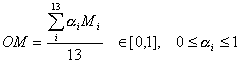
where UL, UR, LL, and LR stand for upper-left, upper-right, lower-left, and lower-right, respectively; (xij,yij) and (xc,yc) are the co-ordinates of the centres of object i on quadrant j and the frame; aij is the area of the object; and nj is the total number of objects on the quadrant. 2.14. Measure of Order and Complexity The measure of order is written as the sum of the above measures for a layout. The opposite pole on the continuum is complexity. The scale created may also be considered a scale of complexity, with extreme complexity at one end and minimal complexity (order) at the other. The linear summation of the weighted measures designated by OM is given by
with
where BM is given by (1), EM by (6), SYM by (9), SQM by (19), CM by (26), UM by (32), PM by (35), SMM by (43), DM by (44), RM by (45), ECM by (48), HM by (50) and RHM by (53). The weighing component a is assumed to be a constant. Aesthetic measure Mi has its own weighing component ai. Choosing weights is one of the optimisation problems that can be addressed with techniques like genetic algorithms. 3. Conclusions and Future Work In this article, we have presented a computational theory of evaluating interface aesthetics. We have introduced fourteen aesthetic measures: balance, equilibrium, symmetry, sequence, cohesion, unity, proportion, simplicity, density, regularity, economy, homogeneity, rhythm, and order and complexity. We have demonstrated that aesthetics can be measured objectively for multi-screen interfaces. With some modification, the techniques presented can also be used for other screen types. The study described here has suggested some improvements to enhance their usability. A layout is in equilibrium when its centre corresponds approximately to the centre of the frame. Practically speaking, there are however, minor deviations from this definition. Owing to the visual gravitational pull, the balancing centre of the layout will lie somewhat higher than the centre of the frame, thereby compensating for the greater weight of the area's upper half. But such discrepancies are small. The formulae outlined in this paper are under continuous review and development. Characteristics that are common to the feeling which gives one an aesthetic experience should not be limited to the few, more accordant ordering principles with appropriate design conventions must be found if this approach is to be improved. Acknowledgements The research reported here was supported by IRPA grant 191/9636/0012. Addendum A: Birkhoffs Aesthetic Measure This addendum describes a specific method for describing polygons (shapes)
given by Birkhoff [21] by the formula
with the following definitions. The complexity C of a polygon is defined as the number of distinct straight lines containing at least one side of the polygon. V is a measure of vertical symmetry. V is 1 or 0 according as the polygon is or is not symmetric about a vertical axis. E is a measure of equilibrium. E is 1 whenever V is 1. E is also 1 if the centre of area K is situated directly above a point D within a horizontal line segment AB supporting the polygon from below in such wise that the lengths AD and BD are both more than 1/6 of the total horizontal breadth of the polygon. E is 0 in any other case when K lies above a point of AB, even if A and B coincide. E is -1 in the remaining cases. R is a measure of rotational symmetry. R is the smaller of the numbers q/2 and 3 (where 360° /q is the least angle of rotation which rotates the polygon into itself) in the case of rotational symmetry, provided that the polygon has vertical symmetry or else that the minimum enclosing convex polygon has vertical symmetry and that the niches of the given polygon do not abut on the vertices of the enclosing polygon. R is 1 in any other case when q is even (i.e., if there is a central symmetry). R is 0 in the remaining cases. HV is a measure of the relation of the polygon to a horizontal-vertical network. HV is 2 only when the sides of the polygon lie upon the lines of a uniform horizontal-vertical network, and occupy all the lines of a rectangular portion of the network. HV is 1 if these conditions are satisfied, with one or both of the following exceptions: one line and the others of this type may fall along diagonals of the rectangular portion or of adjoining rectangles of the network; one vertical line and one horizontal line of the portion, and the others of the same type, may not be occupied by a side. At least two vertical and two horizontal lines must be filled by the sides however. HV is also 1 when the sides of the polygon lie upon the lines of a uniform network of two sets of parallel lines equally inclined to the vertical, and occupy all the lines of a diamond-shaped portion of the network, with the following possible exceptions: at most one line and the others of the same type may fall along diagonals of the diamond-shaped portion or of the adjoining diamonds of the network; one line of the diamond-shaped portion and the others of its type may not be occupied by a side. At least two lines of either set of parallel lines in the network must, however, be occupied by the sides. HV is 0 in all other cases. F is a general negative factor. F is 0 if the following conditions are satisfied: the minimum distance from any vertex to any other vertex or side or between parallel sides is at least 1/10 the maximum distance between points of the polygon; the angle between two non-parallel sides is not less than 20° ; no shift of the vertices by less than 1/10 of the distance to the nearest vertex can introduce a new element or order V, R, or HV; there is no unsupported reentrant side; there is at most one type of niche and two types of directions, provided that vertical and horizontal directions are counted together as one; V and R are not both 0. F is 1 if these conditions are fulfilled with one exception and one only. F is 2 in all other cases. Using the above conventions, it can be shown that the normalised value of Eq. (62) is
References
|
 (4)
(4)
 (7)
(7)
 (8)
(8)
 (10)
(10)
 (11)
(11)
 (12)
(12)
 (17)
(17)
 (19)
(19)
 (21)
(21)
 (27)
(27)
 (28)
(28)
 (29)
(29)
 (30)
(30)
 (31)
(31)
 (34)
(34)
 (36)
(36)
 (39)
(39)
 (40)
(40)
 (44)
(44)
 (47)
(47)
 (51)
(51)
 (52)
(52)
 (54)
(54)
 (55)
(55)
 (56)
(56)
 (60)
(60)