|
WORKS IN DIFFERENT MEDIUMS ISTVÁN OROSZ
During the lecture I plan to show some of my etchings,
anamorphoses and animated films as well. All of them are infected by the
above mentioned virus. I will try to defend them and to explain the hidden
meanings of them in the background.
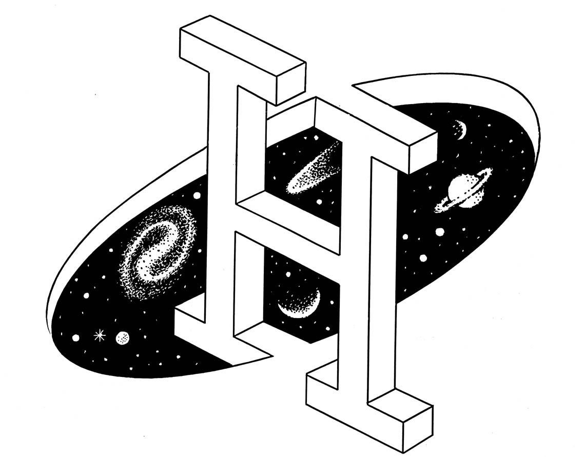
THE BIG "H" LETTER I have drawn this capital letter "H" some years ago. "H" is the first letter of the name of my homeland, its internationally known symbol. Examining the image carefully these words appear: illusion, impossibility, paradox - or some of you can simply say that the designer having drawn the letter "H" is aiming at cheating, leading the viewer by the nose. As it happens the words for "advertisement" and "lie" also begin with the letter "h" in Hungarian, in my mother language and it is hardly by chance that I mention the notion of telling a lie when speaking about advertising graphics. There is no use to be euphemistic: advertisements show certain things more beautiful, more desirable than they really are - in other words: spectators are lead astray. I admit this is a rather serious dilemma of a profession, of a field of art - but in the meantime a possible solution also comes to my mind: what if the designer makes it clear right from the very beginning that we step into the world of illusion. Can it offer a solution of the problem?
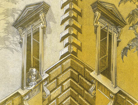
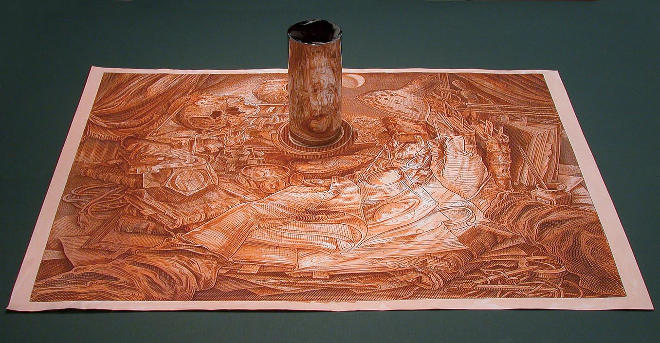
Corner House, 1989. Optical illusion, visual paradox, impossible objects, special points of view - or with an elegant French terminus technicus: "trompe I'oeil" which means deceive the eye and deliberately distort perceptions - these are the phrases people tend to use referring to my graphic works. I would like to speak about them: about my approach, my intention, my viewpoint. Also I show some of my new and old pictures: design works, etching, engravings and animated films. Please forgive me this subjective approach. I do hope that some conclusion of the verbal text and the reproductions will make link to the theme of the meeting: to symmetry in general.
Self portrait with Albert Einstein,
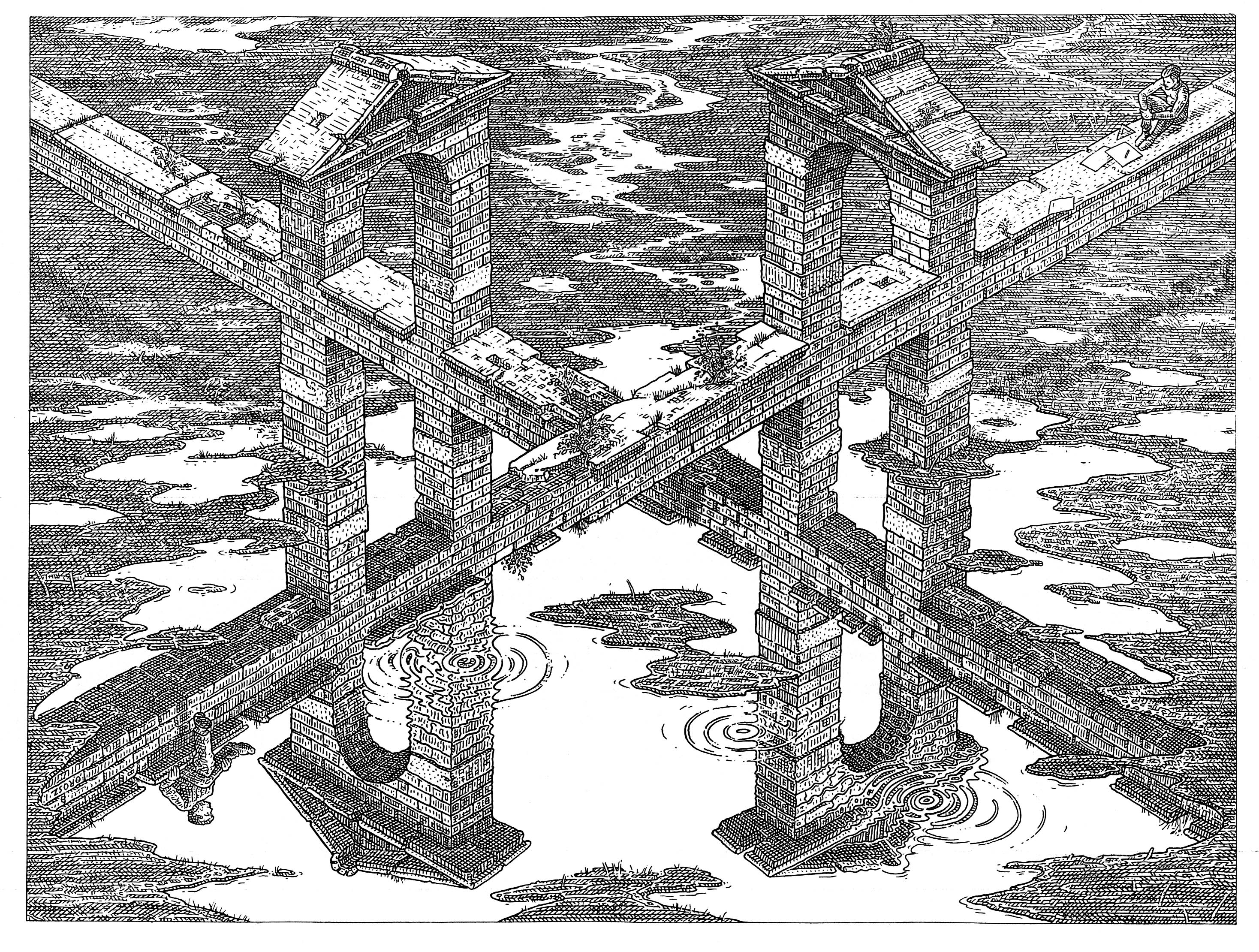
Crossroads, 1998.
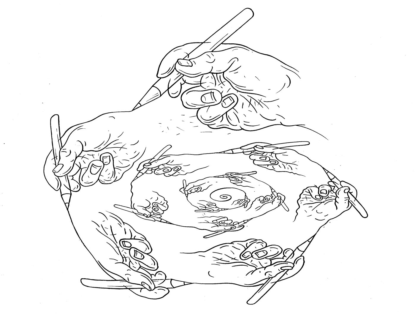
Spiral, 2001.
|