(i) Thickness of lines

A bold line is powerful, and a thin line is sharp, delicate, and nervous. A thin line also has a feeling of speed. When lines of different thicknesses are inserted into a KOHSEI (Basic Art & Design) of lines of the same thickness, these effects are emphasized all the more. In addition, the thickness of the lines generates a feeling of positional relationship. A bold line appears in the front, and a thin line behind (Fig. 53).


(ii) Lines and brightness

There is a problem with the brightness of lines. If the thickness and length of lines are fixed, dark colored lines appear closer than light colored lines (Fig. 55). The pattern in Figure 56 is composed of thick lines made by stripping screen tones with minute parallel lines or high density small points. Each line has a variation in tone, and kinked lines are used. These two factors make us feel a strong unevenness.


(iii) Lines and spacing

When arranging lines whose conditions such as thickness, length and brightness are all the same, an assembly of lines with a narrow spacing appears behind those with a wider spacing. If a systematic KOHSEI (Basic Art & Design) is made using this mechanism, strong feelings of perspective and cubic effects can be expressed.


55
 
57


56
 
58


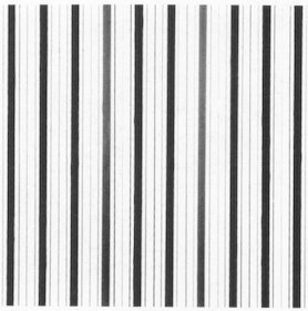
Figure 55: Composition of lines differeing in brightness.
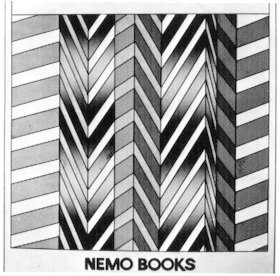
Figure 56: The effect of a feeling unevenness created by the gradation of tones.
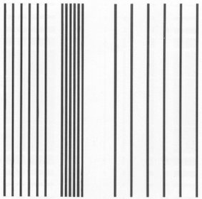
Figure 57: Composition of lines with narrow spacing appears further back.
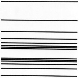
Figure 58: An expression of strong perspective using systematic composition of spacing.


NEXT

CONTENTS